
There's No Place Like Home
Everyone knows that the key to reaching your target audience is by creating a homepage design that is enticing, appealing, and extremely user-friendly. However, not everyone understands exactly what web design elements can be used to create this experience for visitors and potential customers. If you take a look at some of your favorite website homepage designs, you'll come to find that many of the best homepages share common elements. In this article, you'll learn what can make one site's design stand out among the rest while finding inspiration from homepage designs that have been proven to succeed.
Why a Good Website Homepage is Important
When someone opens up your website's homepage, you have less than one second to create a lasting first impression.
Three studies found that the average person makes their initial judgment about a company after looking at their homepage design for only 50 milliseconds. This means that if your homepage design isn't up to par, it won't matter if the rest of your website layout is perfect.
Beyond giving a great first impression, there are other key benefits to going the extra mile on your homepage design.
Increased Conversion
It's proven that websites with homepages that are clear and creative result in higher conversion rates. This means that you have the potential to make your website visitors become paying clients using nothing but the power of a well-designed homepage. When a visitor arrives, you have the opportunity to immediately direct them to your unique selling proposition and convince them to invest in you and your company.
High Traffic Area
Your website's most visited page will be its homepage. This portion of your website will have the highest traffic, which means it will have the best opportunity to direct visitors to your services. Use this to your advantage, and make sure the potential client’s first impression is the best one possible.
Represents You In Search Engines
If someone is searching for you or companies like yours online, the page that comes up in their search will be your homepage. This means that your homepage design will be their first view of your company. Regardless of the quality of your site's other web pages, your homepage will undoubtedly contain the most direct impact.
10 Elements of a Standout Website Homepage
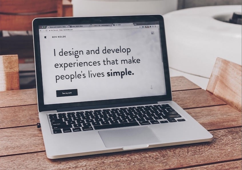
1. Eye-Catching Media
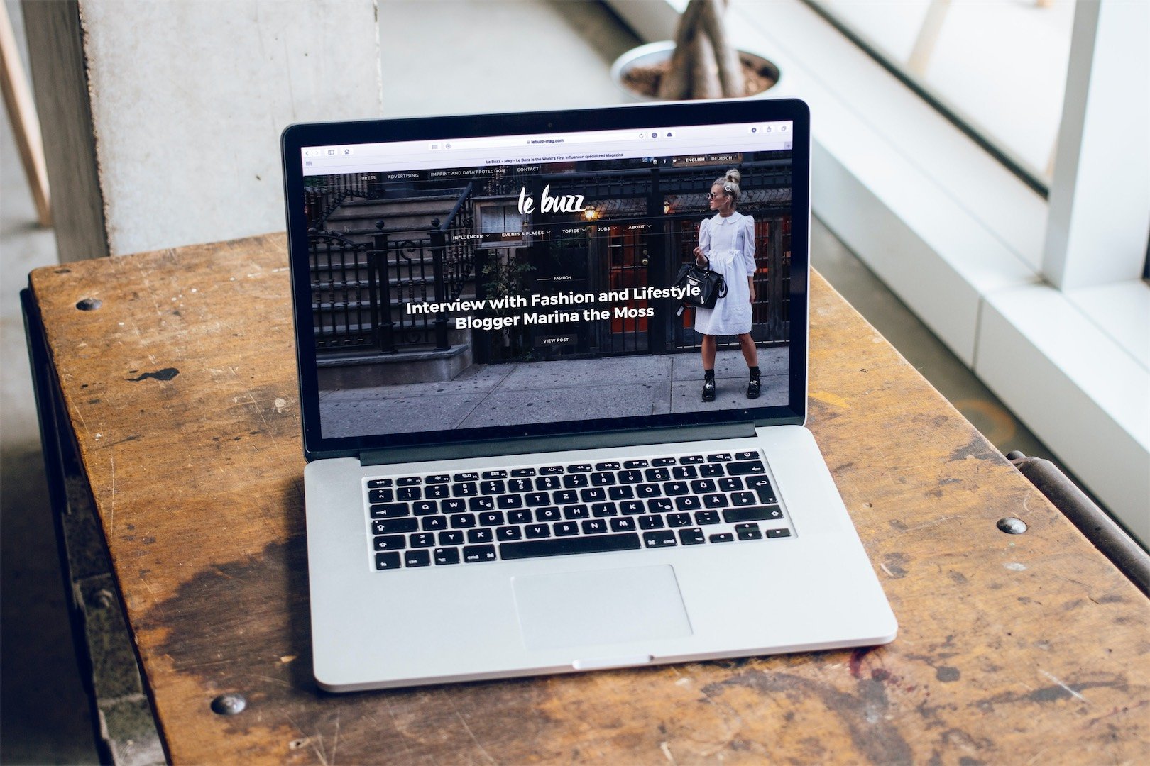
Nothing catches the eye quite like a stunning featured image or embedded multimedia element. Utilizing photos and videos on your homepage design can make all the difference when it comes to standing out. Whether it's animated illustrations or informative videos, make sure that something on your homepage appeals to your audience using an element other than words.
However, be sure to consider the relevance of this design decision as well. If the image isn’t relevant, then there's no point in using one at all. Include things like before and after photos, clients interacting with you or your product, and personal photos of your company to create a sense of community. While building your homepage design, consider what kinds of images stand out and communicate your business or product most effectively.
![]()
2. Brand Logo
Your brand's logo is reflective of your entire image. Including your logo is, of course, necessary for a quality homepage design. If you're just starting out and your brand doesn't have a logo yet, take the time to create one. Your general web design will benefit from including this kind of brand imaging throughout its pages, and site visitors will then be able to have immediate brand recognition the next time they see your logo floating around on the world wide web.
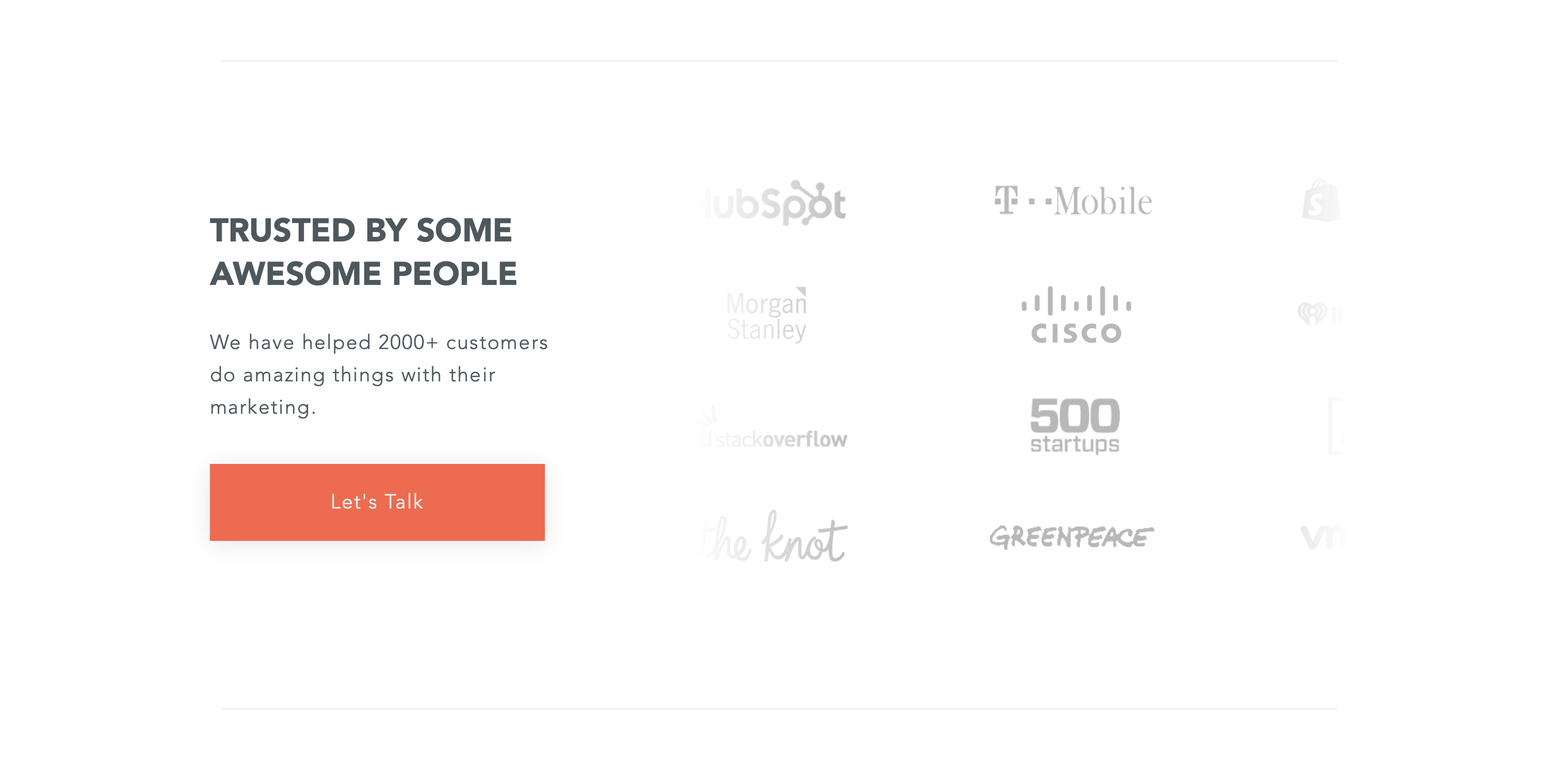
3. Social Proof
Social proof is an excellent way to let visitors know the quality of your services straight from customers' mouths. If a potential client sees that you've worked with someone credible, well-known, or someone who has a glowing opinion of you, it will make them all the more likely to stick around and see what the rest of your website has to offer.
The social proof that you use can be a number of things aside from a client testimonial: many quality homepage design examples have data-based social proof like case studies, and others display the awards or certifications your company has received. No matter which you use, the key to having quality social proof is ensuring that it resonates with your specific target audience.
Client Logos
Client logos are a great thing to include within your homepage design, particularly because they can showcase who you've worked with while leaving a good deal of space for other content. Only using a logo might not always be the way to go, but if you've worked with recognizable brands, it could be beneficial to use their easily-spotted symbol rather than writing out the company's name.
Testimonials and reviews
If a customer wants something done well, they want to know how others have felt first. Homepage designs that include testimonials or reviews will certainly be looked upon more highly by visitors because they build credibility and foster trust from the get-go. A good website homepage design makes visitors look around, but the best homepage makes visitors stay to consume the content.

4. Clear Navigation Tabs or Bar
The last thing that navigating visitors want to do is spend their precious time looking for a way to get around your website. When a homepage design includes a navigation bar that is easily viewed and accessible, it can make those visiting more inclined to explore the remainder of the website. Even if you only have a one-page website, you can still use a navigator to auto-scroll the user to the content section they're searching for.

5. CTA Buttons
You have a purpose when creating your homepage design: to attract potential customers and clients. What is it that you want them to do? Whether completing a signup form, reading a newsletter, or purchasing a service, you need to utilize a clear call to action if you want the best homepage you can get. A CTA button is a straightforward tool that is used to highlight your desired primary calls to action. Without one, your visitor is left to their own devices and may not have a clear sense of direction during their visit.
When it comes to placing a CTA button, the more the merrier is the standard rule of thumb. Make sure that the user has multiple opportunities to do whatever it is you're asking of them, and that while you want the primary call to action to take the spotlight, you include plenty of secondary calls to action too.
Having a clear path to conversion is crucial because if users aren't guided toward their goals on a website, they may become confused or frustrated and leave, resulting in increased bounce rates and decreased conversions. To ensure a clear path to conversion, deliberate calls to action (CTAs) should be implemented on every page. CTAs must be easily visible, prominent, and tailored to the user's needs or interests. This strategy increases the likelihood that users will take the desired action, improving conversion rates and user experience.
A call to action button can be something simple or something complex, with some common examples being popups, chats, or invitations to click the CTA button and be taken to a different part of the site. It all depends on your particular services and what primary call to action you deem the most necessary to highlight.

6. Hero Section
The hero section of a website's homepage plays a crucial role in capturing users' attention and differentiating a brand from its competitors. It should clearly communicate what the brand offers and how it can improve the lives of its target audience. To achieve this, a short, punchy statement that uses impactful verbs, adjectives, and outcomes of what the brand impacts can be used, followed by a powerful description of how the brand is proven to act on important elements of what it impacts. To make the transformation more evident, imagery such as product shots, someone using it, or an illustration or video can be used. By creating a hero section that is clear, impactful, and visually engaging, a brand can better connect with its audience and encourage them to take action.
7. Intriguing Color Scheme
If you want to attract viewers and captivate them immediately, you need to be sure that you include an intriguing color scheme. A good color scheme, especially within homepage designs, says a lot more about your brand than one initially assumes. It can make the content easier to read, help avoid the appearance of too much clutter, and give website visitors something to admire as they read through the page's content.
It is important to consider what kind of message and objective it is that your brand has. Depending on the color scheme used in your homepage design, you can broadcast very different messages about what your brand stands for.
For example:
- Red is often associated with power
- Blue can be associated with feelings of tranquility
- Bright and bold shades inspire excitement and fun
A successful color scheme is also one that accounts for ADA (American Disabilities Act) compliance. When structuring your website, consider these four principles to get the best homepage possible:
- Perceivable: All users should be able to perceive the contents of your site. This means including text-to-speech and ensuring your color scheme is friendly to those with color blindness.
- Operable: Any user should be able to operate the tools within your site, so make sure that your HTML reflects this.
- Understandable: Aside from being able to view the content on the website, ensure that the content is universally understandable, or includes tools to assist with more complex things.
- Robust: If disabled users are accessing your site using assisted technologies, be sure that the content of your website contains the full user experience. Don't shorten things like directions or descriptions; treat all users equally.
8. Clear Typography
If you want your website layout to be fluid, it's best that you use a typography style that is easily read at a glance. This means, typically, that you want to use san-serif fonts for your text. You also want to be sure not to go too crazy with your fonts, using only three to four different font types throughout your website. Remember- the best website homepage design is one that puts clarity above all other supporting elements.
In the end, the focal point and captivator of your site should be its content. Using strong typography, while also an important design element, is mainly used to make your content as accessible and clear as possible.
9. Engaging Content or Copy
Now that we've covered the aesthetics of design, let's not discount the importance of the content as well. If you want to reach your target audience, you need to be sure that visitors fully understand why they've stumbled upon your site and what it is you have to offer them. This means crafting a compelling value proposition using the power of good copywriting.
When you're sharing information about your product or service, make sure that you're advertising in a digestible way. Technical terminology may be suitable in some circumstances, but it is usually better to keep things simple and sweet. This means avoiding long, drawn-out descriptions and deep dives in your homepage design. Let your visitor know exactly what they need to do. No more, no less.
10. Useful Footer
The footer of your homepage is an element that truly represents the idea of last but not least. A website footer is the content section that is placed at the very bottom of the web page but contains some of the most important information. Though it might be seen as an opportunity to get flashy, it's best to avoid that and instead keep things succinct and informative.
Your footer is also useful, aside from the header's navigation menu, as being the primary place to put links to other areas on the site. Though the user may have scrolled to the bottom of the page, you still want to entice them to go further and look at things more closely.
Other important things that are typically included in an effectual footer are contact information, your company's privacy policy, and a CTA button. This call to action could be both primary and secondary calls, most notably being an email signup or other signup form.
5 of the Best Website Homepage Examples
Now that we've discussed what makes a solid homepage design and a few key benefits of crafting and maintaining your homepage, let's look at some of the best homepage design examples and see what makes them so successful.

1. Oregon State University
Many elements make Oregon State University's design such a strong homepage example. First off, you are immediately greeted with great use of hero space. Within this section, we see that the homepage design utilizes inspiring copywriting and an immediate visual appeal in the form of an overhead view of the university's campus. Students are likely curious about the campus' appearance, so this is an excellent way to showcase their beautiful space to their target audience right off the bat.
In addition to their hero space, the entirety of the homepage design has solid colors and consistent promotions of a call to action. For example, within the first 10 seconds of arriving on the page, users are greeted with a prompt to download a free learning guide. This kind of immediate interactivity is what will increase your chances of CTA's being met.
Getting around their site is incredibly easy, too. Their menus are clear to see and well-organized, and white space is utilized throughout to break up the page's various sections. The university's website also contains social proof, a sound tool that makes for some of the best homepage examples. You are met with moving, well-written testimonials from students on the campus and professors alike.
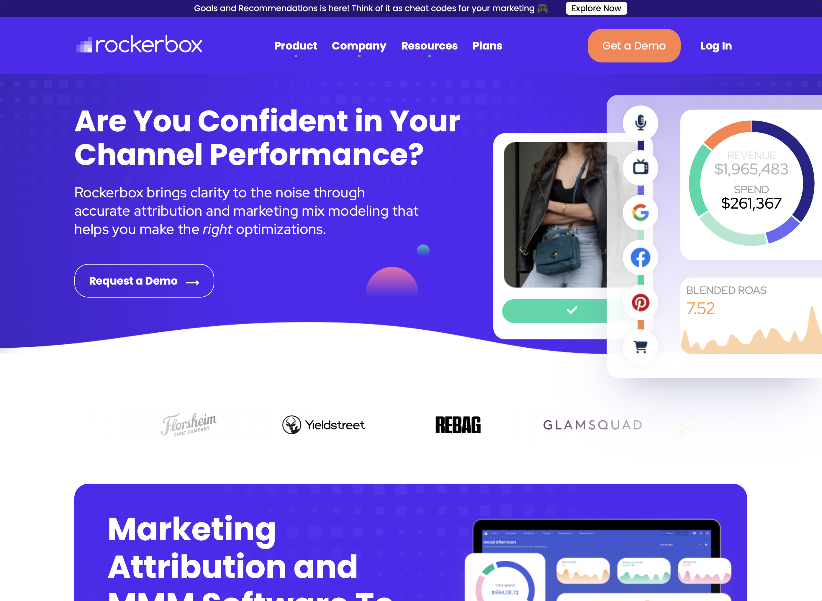
2. Rockerbox
Perhaps the most striking element of this homepage example is Rockerbox's bright blue background and use of modern design conventions to create a first impression that truly pops. Not only is the color scheme top-notch, but the choice of typography continues with a cheerful theme while still being easy to read and process.
Rockerbox also takes advantage of interactive web design. As users scroll through the page, the graphics contained within move right along with them. This makes the visitor's experience more engaging and causes them to want to continue with their venture.
Another thing that Rockerbox's homepage design does well is making use of strong social proof. When creating the client testimonials section, designers chose to display the brand logos of their previous clients more obviously than their actual names. This is because the brands listed on their testimonial list are quite popular and easily recognizable to consumers. So, when they have that brand recognition, they are immediately more inclined to trust the company.
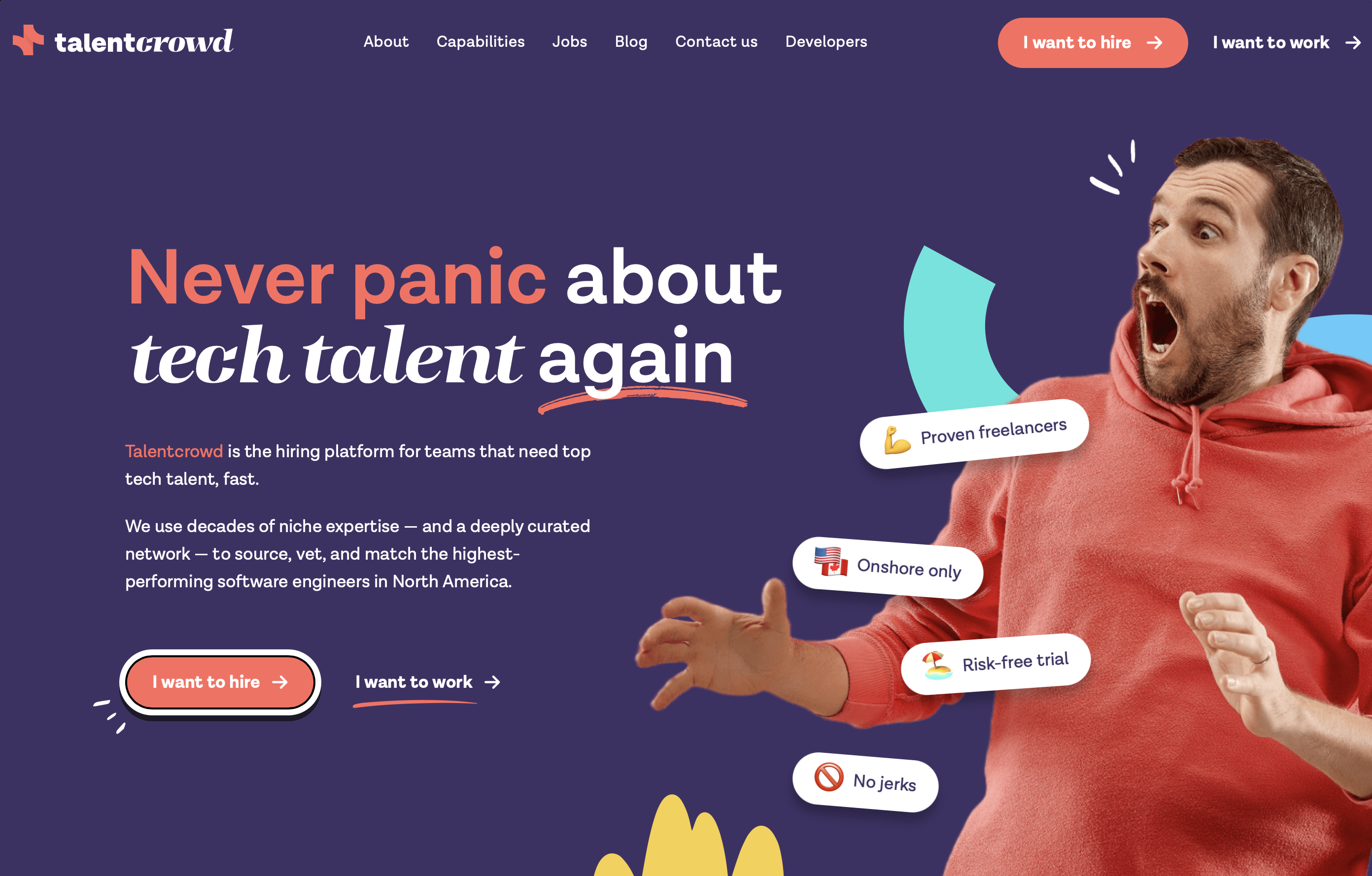
3. Talentcrowd
Much like Rockerbox, Talentcrowd is another one of our website homepage design examples that employ an interactive website homepage. Many elements of their homepage pop up as the user scrolls, and their navigation bar stays right along with them.
Talentcrowd's social proof is front and center, one of the first elements that the user is greeted with upon opening up the page. By doing this, the site can establish not only trust but also industry dominance very early on. Since they have had many clients, they opted to display only their logos, but in their case, it makes for a very clean homepage example.
The top of Talentcrowd's site is also a shining example of homepage designs that take full advantage of the hero section. Using a combination of moving elements and bold, large typography, this section is eye-catching and prompts the user to continue scrolling. Talentcrowd's site uses the single-page site approach or a more blog-like homepage, so the combination of elements creates a user experience that is smooth and almost seamless.
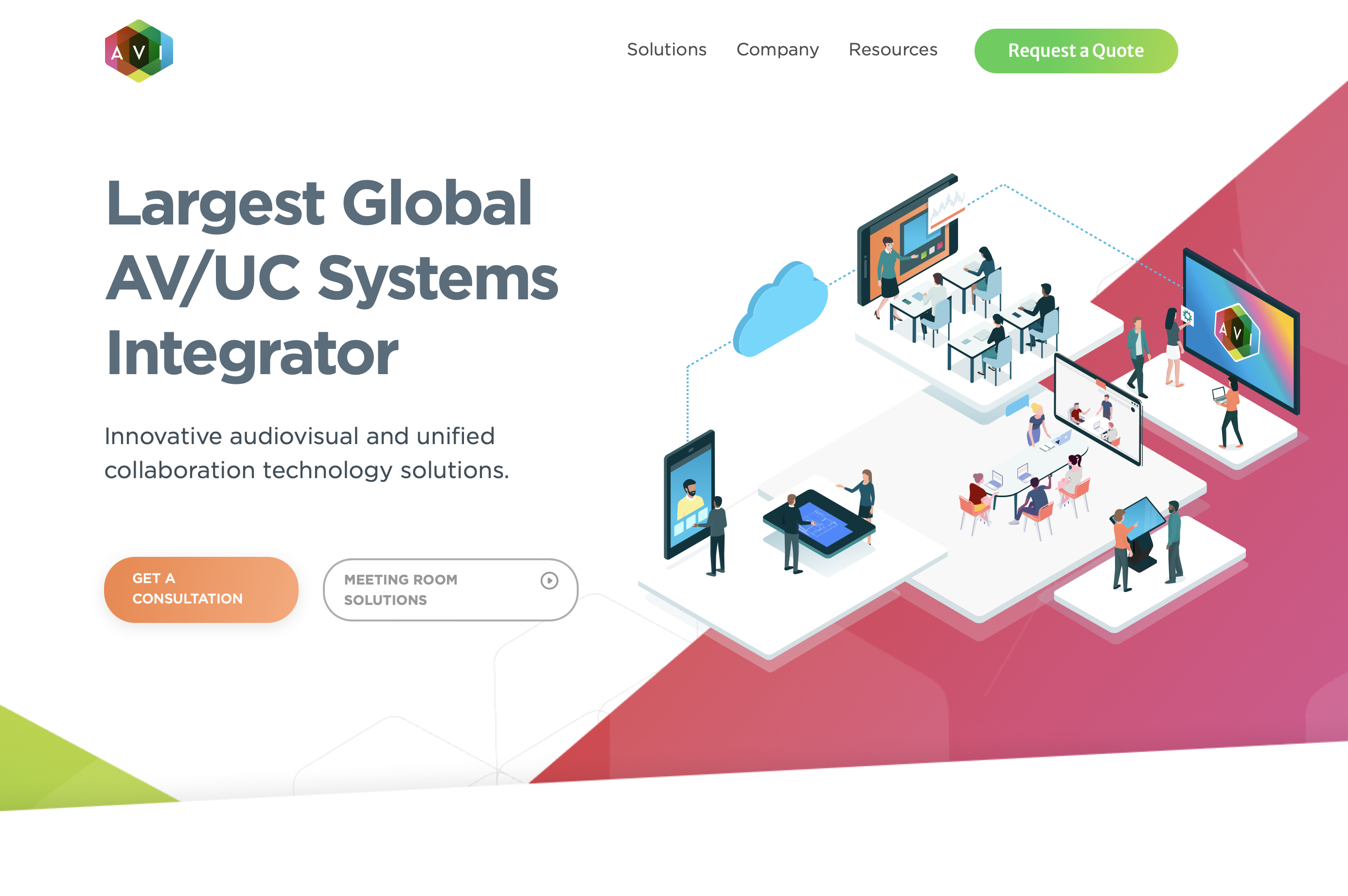
4. AVI Systems
Nothing creates a more awesome homepage than one that is both efficient and pleasing to the eye. That's why this homepage example, AVI Systems, really takes the cake. Their website effectively reaches its target audience through the use of eye-catching CTA's, easy-to-find information, and attention-grabbing color schemes.
Their use of white space makes the many integrated details easy to understand and creates a very cohesive result. Some of the best homepage examples know how to use the space they have to clearly convey what users need to know. AVI Systems does this flawlessly, taking the opportunity to use its visitor's attention to direct them to the business' value proposition and subsequent CTAs.
An aspect of this homepage example that stands out among the rest is its footer. The footer space within this website is incredibly detailed, making for a customer-centric design that is easy to navigate and not a hassle to peruse, especially with the assistance of its integrated search form.
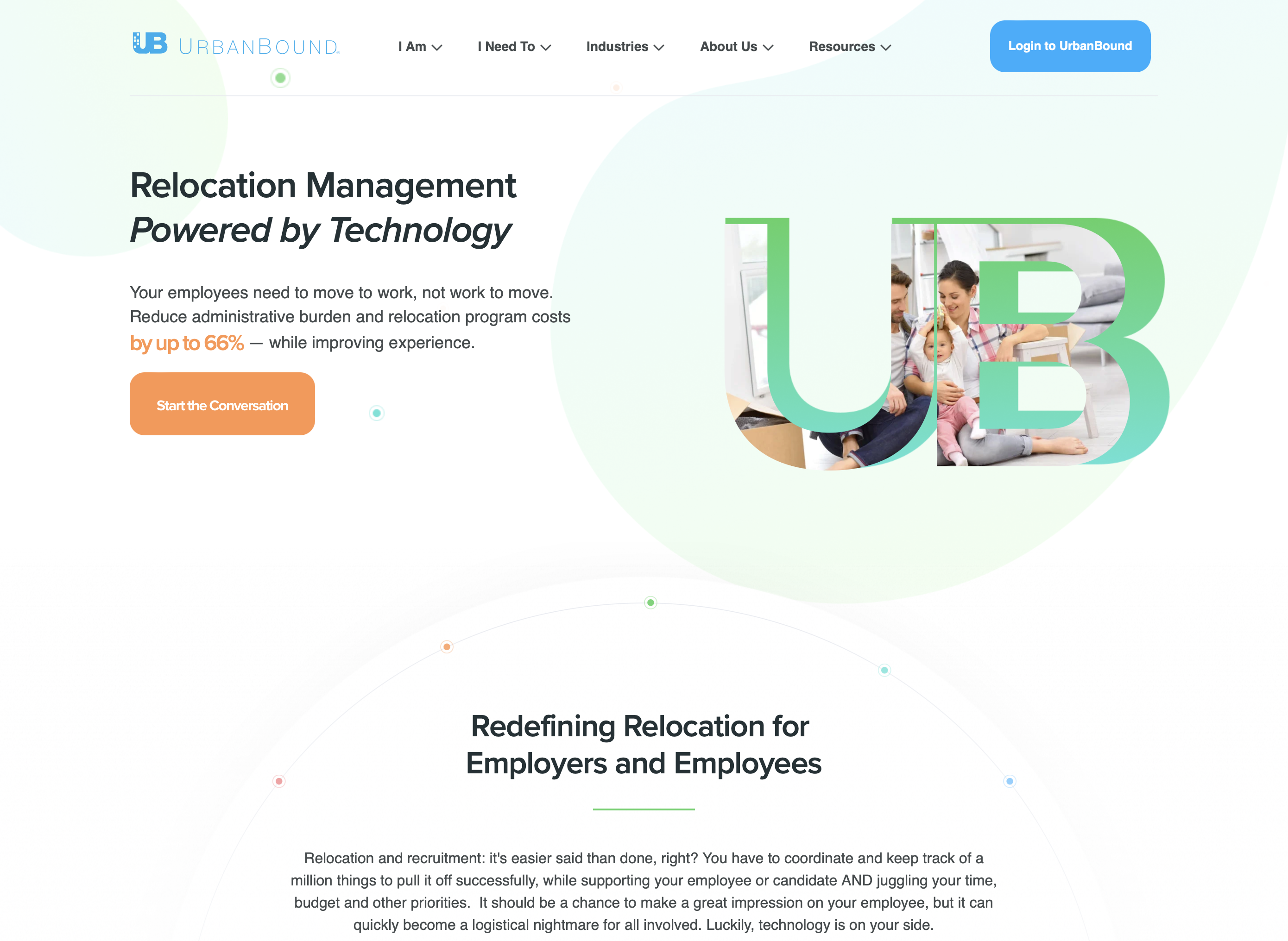
5. UrbanBound
UrbanBound, an employee relocation management company, reels in users with its signature bright green before exhibiting all of the elements of a great homepage. The ultimate example of an aesthetically pleasing design, the site's color scheme, typography, and contrast with its dark background make the ideal introduction to its target audience and make its conversion paths stand out.
Another aspect of UrbanBound that makes it a shining homepage example is that it has a clean design that is completely optimized for mobile devices. It is a very important consideration to create a page that can be used cross-platform through multiple devices, and not all design examples (even great ones) can meet that criterion.
The best homepages are ones that can not only grip attention but keep it too. Their copywriting and social proof keep things concise, using only what is important to convey their message. Business users require information that is clear and consistent but also that won't waste their time.
Use Outside Help
You won't be able to create the best homepage overnight, but it's not impossible to make something show-stopping with enough commitment and dedication. Designing takes time, much like all good things, but you're sure to discover that hard work pays off.
If you aren't certain where to start, need an overhaul of your current homepage design, or simply don't have the spare time to dedicate yourself to homepage optimization, you can always consider outsourcing to an outside company.
Many website development companies can help with services anywhere from the actual design to marketing and other services. Those who want more from their experience could benefit from such a solution.
For a helping hand in creating the best homepage possible for your business, contact Web Canopy Studio today for a website evaluation.


