Fun fact: When I started writing this blog article, I realized it was Web Canopy Studio's 12-year anniversary. That's 12 years since we started this company.
We started as a website development company, doing a lot of little WordPress sites for restaurants, small businesses, and local companies. And we've grown and evolved into something bigger, something I couldn't have imagined when I quit my day job 12 years ago and launched Web Canopy Studios.
We're still doing websites, only now we're doing some really cool stuff with them. Especially when we're applying these website trends to a lot of software companies, SaaS businesses, and B2B high-end services like HubSpot.
So we may still be a website company, but what we do now is very different from what we originally started out to be. (Which is the case for any successful business: you have to evolve as time goes on.)
That got me thinking through some of the things I've been seeing lately, even over the past few years, about the successful things and beautiful trends that have happened on websites.
The design trends represent their brands so well, and they help prospects and customers to stay and engage with the websites and have a great experience. I've figured out that these are the three must-have design trends for your website.
1. Break the Plane
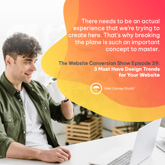
One of the mantras I repeat over and over and over again to our design staff is that we have to make sure we are breaking the plane. Break the plane. Break the plane.
We're not referring to a plane or even a type of prairie. We mean the ordinary, the mundane, the everyday.
What that means is that when you look at a website, especially a decade ago, you would see some harsh, blocky designs where the designer said, "We're going to put section one here, and section two here, and section three here."
And they followed the same design rubric that everyone else did, and you ended up with identical-looking websites, especially in WordPress.
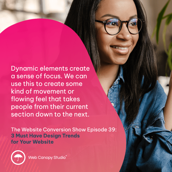
One of the best ways to break the plane is to bust up those sections and create a sense of flowing movement on the page, where the sections overlap or flow into each other in a nice, smooth way. There aren't sharp delineations between sections, like a solid line between each section.
Rather, it's a visual element where you have, for example, a white header, and the next section down has ocean waves as the background. You could create the background of the site so the waves actually begin in the header and the design flows smoothly down to the middle. This way, the ocean background isn't limited to just one block, it flows through the entire design.
The visual elements allow you to move the user down through the page and to stay, because people will naturally follow the design. We naturally follow paths that are laid out in front of us.
But if we see these harsh solid lines between sections, it doesn't create a sense of "I want to see what's down there," it's more like "that's the end. I can stop here. And if there's another section, I don't really want to go on."
So subconsciously, these small design elements may not seem important, but they can have a big impact on how your users feel about your website.
2. Create Moving Elements
The next item to include in your website design is a moving element. It's more than just a sense of flow, as I described above. I mean more subtle design characteristics that might sit behind or next to major elements of the website.
In my previous example of ocean waves, these could be a slight motion of the waves behind a text block or a photo. Or it could be a small fish that's just swimming around in the background. Not so much that it distracts viewers from what I want them to see, but just enough that it catches the viewer's eye.
These moving elements can help showcase what it is we want people to do on the site. So don't just have your little fish swimming around, have her swimming next to the important bullet points or your big red ORDER NOW button.
3. Use Real Photos of Real People
Finally, use photos of real people on your website, specifically people — clients, your team, etc. — experiencing success using your product or service.
Don't use animated graphics or especially a bunch of stock photos. (Are we all sick of the guy pointing a banana like a gun yet?) Those aren't helpful. If I'm going to be a customer of a company, I want to see people who look like me, achieving the things I want to achieve someday.
It's aspirational. It helps people visualize themselves having that same success. So you need aspirational images that show what success looks like.
Those are the three must-have design trends that companies should start adopting on their websites because that technology exists now: Break the plane, incorporate moving elements, and then show real photos of aspirational success.
If you want to see how else you can improve your website, take the website conversion assessment. You'll answer 30 questions through a self-guided exploration, and it will return a detailed report about how your website is performing today.
It will also give you a checklist and all kinds of cool ideas to make edits and adjustments to your site, and show you the way you can improve your site and increase your web conversions.
Web Canopy Studio is considered one of the top web design companies in the USA. Read more


