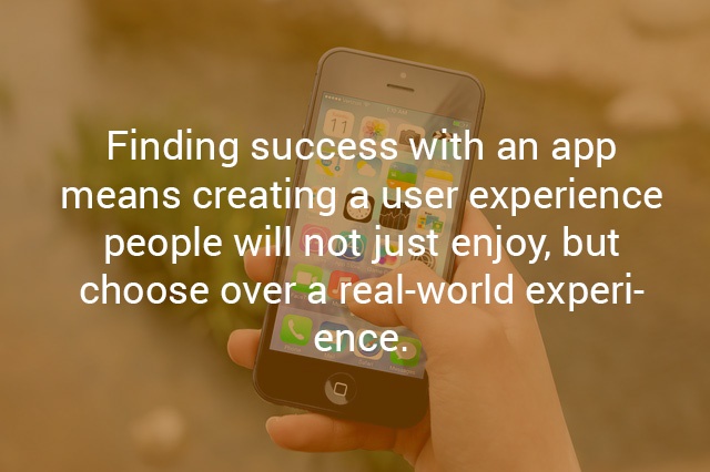
Finding success with an app means creating a user experience people will not just enjoy, but choose over a real-world experience. And that makes sense--if you’re going to solve a real-world problem with technology, you need to root your solution in a person’s real-world experience, then make it better; like if you’re Uber, make hailing a cab from your phone easier or faster than waving a hand in the air.
But what happens when the experience you’re looking to mimic is one
nobody enjoys? Take air travel, for example. What began as a luxury for the wealthy in the 1950’s is now a headache the masses endure instead of celebrate. Security checkpoints, check-in counters, shifting gate information, and tight connections leave a lot to be desired in the way of real-world experiences for companies like American Airlines and Delta. So how do they design an app experience that will delight users when real life offers no guidance?
In this article, we’ll take a look at some of the best examples of effective air travel apps, explore their connections to the real-world experience of flying, and pinpoint some of the ways their designers went above and beyond to actually make some small part of air travel enjoyable.
American Airlines iOS App: Letting the Tickets Do the Thinking
In the old days before smart devices and computerization, if you needed to fly somewhere, you called in and ordered a ticket. You showed up 3-4 hours before your flight to check in, where a desk attendant printed your ticket with your gate information. Then, you waited, keeping a close eye on the Departures board in case your flight changed.
Today, throw in slow TSA lines and new rules about what you can or can’t carry on a plane, but not much else has changed over the last few decades except prices. When a company like American Airlines tries to digitize the check in experience, they want to streamline a commonly lousy experience so customers have less to juggle when flying.
American Airlines has pioneered smartphone technology for airliners with their iOS app. Their app seamlessly addresses the common concerns of an air traveler both before and after arrival in a way that feels natural to the user in the context of traveling, like using any other part of an Apple iPhone:
- Lock Screen Notifications: On the day of your flight, the AA app will place a notification on your lock screen so you can quickly pull up flight information or notice itinerary changes just by glancing at your phone.
- Wallet Ticketing: Many Apple users rely on Apple Wallet (formerly the Passbook) to store loyalty cards and payment methods. The AA app allows users to add TSA-friendly boarding passes to Apple Wallet.
- Apple Watch Integration: AA has even integrated its app onto the Apple Watch, taking all the app’s features right to users’ wrists. Between custom complications and home screen shortcuts, users can find everything they need at a glance.
Delta’s iPad App: Meeting Users Where They Are
Delta’s understanding of this notion of contextual user experience is evident in the design of their iPad app. It’s distinct from their smartphone app and their standard mobile web application; the iPad app focuses less on minute-to-minute updates and ticketing features, and more on the many reasons people fly to begin with. That’s because of the context of the iPad itself. All of these features are ones the user might utilize before a trip, or once they’re on board a plane--not while they’re actually running around an airport. Nobody runs around an airport with an iPad out, and nobody is thinking about what movie they’ll watch on the flight while they’re racing to make their gate on time.
While the iPad app shares much of the functionality of the smartphone app–you can book flights, check in, pay for checked baggage, and access gate information, for example–it also boasts many features that reflect an understanding on Delta’s part of what separates an iPad user from an iPhone user (including taking advantage of a bigger screen):
- Destination Guides: Browse travel guides for many of Delta’s most popular destinations to plan your trip.
- Glass Bottom Jet: Get a look at the places you’re flying over with geographical maps and images from right below the plane.
- In-Flight Entertainment: Browse Delta’s in-flight entertainment options and enjoy them on your device, including downloads of their magazine.
What This Means for Other App Developers
Much of the time, good user experience design takes a back seat to other considerations. Maybe the founder of a SaaS company has some killer feature they just know will make their app the next big IP. Or maybe an investor wants to hit a certain launch date, so features get cut, or design gets rushed to make the deadline.
Here’s the thing: if there’s a market for your app, your potential customers will know what they need better than your instincts do. Good user experience design requires a solid understanding of your target audience, of the pain points you’re aiming to relieve, and of the needs and motivations driving every user’s interaction with your app. A little user research goes a long way, and if American Airlines and Delta can teach us anything, it’s that smart solutions can even improve on the real world, as long as the context for the moment of use is kept front of mind during design.


