
Selling a service or product online may be a beautiful (or a disastrous) thing. While it is highly suggested to use your website to sell your products, you should also analyze your approach and make sure you’re not carrying out any actions that may be damaging to your brand or your conversion tactics. Ecommerce conversion rate optimization is an art in itself - so it's critical to make sure you don't do anything to damage your opportunities right out of the gate.
The Crucial Mistakes
 These are the common, somewhat typical, mistakes that people unknowingly make on their ecommerce website. Inevitably, they are hurting their conversion rate. Why? Because the experience just sucks for users.
Consider your product-selling-website to be an actual brick and mortar store. Think of the most highly successful storefronts in your mind as you go through the list below, and ask yourself “would a successful storefront do this?”
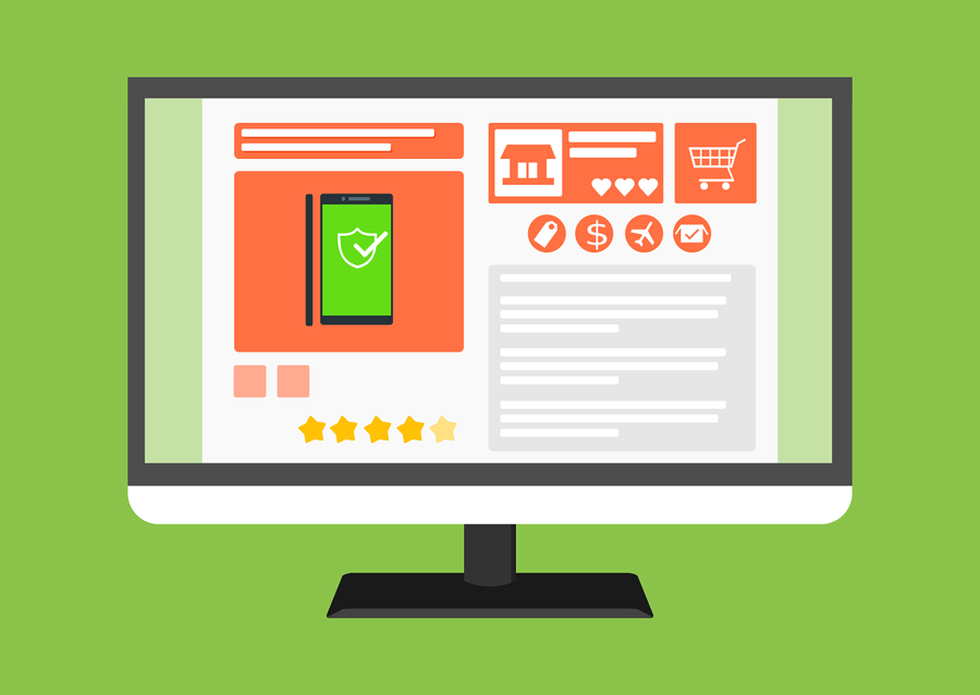
1) Do not clutter the pages upon which you decide to sell your products.
You should treat your product pages just as a landing page. You don't want to give distractions upon immediate review. Yes, related items towards the bottom or maybe small sections of a sidebar are probably fine; however, you really should think about minimizing large amounts of texts and graphics in sidebar advertisements, blogs, or other products that will take people away from the reason they are on that page - the conversion.
When you go to a store to buy a product, do you want the store owner throwing different shirts and funny hats at you while screaming to read their latest newsletter? No, we didn’t think so. Odds are, you wouldn’t go back. Don't let your website behave that way, either.
CORRECTIVE ACTION: Reward your client with a simple, sleek, and attractive interface that drives attention to the text and images of your PRODUCT, not the sidebar, footer, or anything else. The more emphasis on your product, the more likely you will be able to sell.
2) Do not allow different vendors to sell things on your site.
This includes paid advertising. While you may be getting paid from their advertisements, you may also be losing the business and attention of customers that were initially there for you. Not only that, but it looks tacky. If you’re at a store looking to purchase a new shirt, would you feel comfortable with a dude trying to sell blocks of cheese back in the corner? Riiiiight. Didn't think so. Unless your store is a a flea market, just don't do it.
CORRECTIVE ACTION: If you need to allow paid advertising or other vendors to sell things on your site, provide a designated sub-page for your visitors to look at AFTER you have shown them everything you want them to see of your own. Don’t let it be seen before your customers have already committed to you. Let this be a pleasant surprise to your shoppers: “Thank you for purchasing from us – Oh, and by the way, here’s some really fantastic products or deals we wanted to offer you from a partner company that is exclusive to our customers as a reward or a bonus for doing business with us.”
3) Do not place items or content in a difficult place for your customers to find.
When you go to a store just to buy one item, the last thing you want to do is walk up and down the aisles looking for something. You’re not a grocery store. Your website shouldn’t have that problem (I guess if you are an online grocer this doesn’t apply to you?).
Your site should be easily accessible and convenient. Live and die by the Golden Rule of “One-click-away.” Customers should be able to find whatever they’re looking for in no more than two clicks…maybe three, if we’re talking sub categories and specific niches. Don’t complicate your website.
CORRECTIVE ACTION: You can have featured products, deals, specials, etc wherever you like on your home page. However, make sure in your navigation you have an easy to find “shop” or an “all products” menu, that drops down into categories of products (if categories are needed). When your visitor clicks on shop, they should easily be “one-click-away” from adding a product to their cart.
4) Do not hide any charges or fines from your customer.
For example, if you have a particular up charge for handling fees, processing, etc, your customer needs to be aware of it. This rings true especially for shipping charges! Ikea is notorious for this with their online shopping experience. Their customers were filling an online cart, going to checkout, then smacked with an additional $200 charge they weren’t aware of, causing them to leave the site and not buy.
CORRECTIVE ACTION: Make your shipping or other charges visible on your product pages or in the footer of your site so a customer knows what to expect. It can be as easy as a simple disclaimer – “shipping for this product ranges from $6-$20 depending on quantity and destination.”
Conversion Rate Optimization Improvements

Always make sure that security is a vital part of your business
People need to feel secure about everything that goes on during their purchasing process. Don’t lose customers because your page looks sketchy or you fail to tell the customers their privacy is golden to you. Always include a terms and conditions page and a privacy policy. And if you're not using an SSL - hello? who are you?
Always give your customers the ability to find what they need
Some customers know exactly why they are at your site, and don’t want to dig around for your categories. If I’m only interested in buying “tank tops” but don’t want to dig around in categories of “kids clothes, summer section, outdoor wear, etc,” I want to type in “tank tops” to the search bar and see all the tank tops that are available.
Always have great product presentation
This includes high quality pictures, a detailed description of the product, and any warranties that come with it. The presentation of your product or service should be the icing on the cake when it comes to their purchasing decision. If you haven’t hired a professional photographer yet, it’s about that time. Steve Jobs attributed a great deal of the success of Apple to the company experience, from the time they discover, to the time they open a package. Make working with your company an “experience” as opposed to just buying another product.
Giving your users a cohesive and easy-to-follow experience while purchasin from you will do wonders for you conversion rate optimization. Bottom Line: Make the experience as user friendly as possible, and your visitors will engage.


